Overview
Overview and Analysis
This was a conceptual full product design analysis case study on KICK with a focus on improvements in both UI and UX. Analysing any poor UX, visual improvements and suggested strategic design changes that could help increase revenue, conversion and user satisfaction levels for the business.
Main features
These are the main features within KICK. Features that either generate the company revenue, engagement and social interaction amongst users. These areas are of focus as it makes the core of the product.

Current Layout
The landing page felt plain without anything that made me engaged or want me to keep browsing through the product. I felt it needed a strategic visual uplift that help increase engagement, conversion rates and overall improve the visual aesthetic of the product that will help make it stand out in a competitive market.
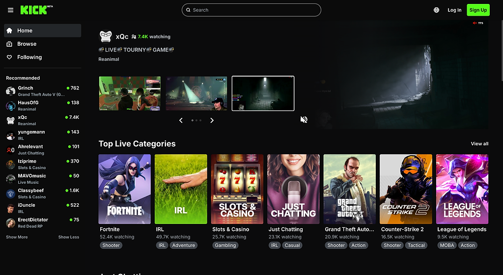
The landing page felt so plain with nothing that made me engaged or want me want to browse. I felt it need a visual uplift that will make it stand out, give it more of an identity,
Potential improvements could be improved visual highlight section so users can easily navigate between trending streams.
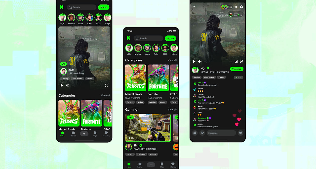
UI Design
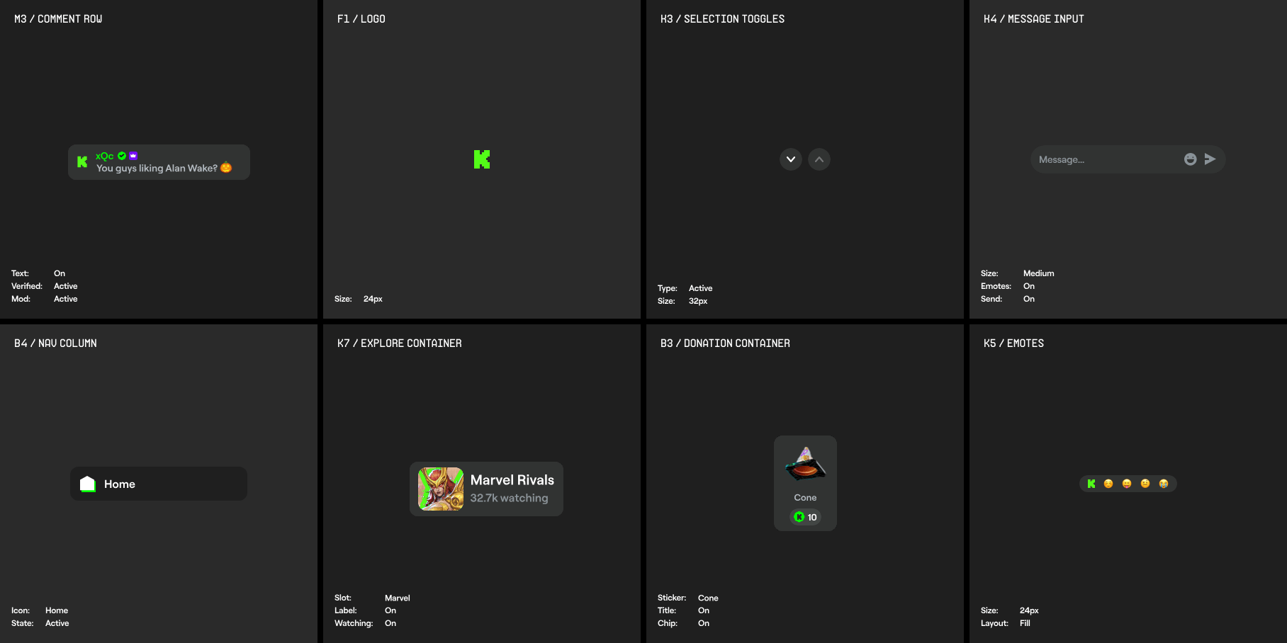
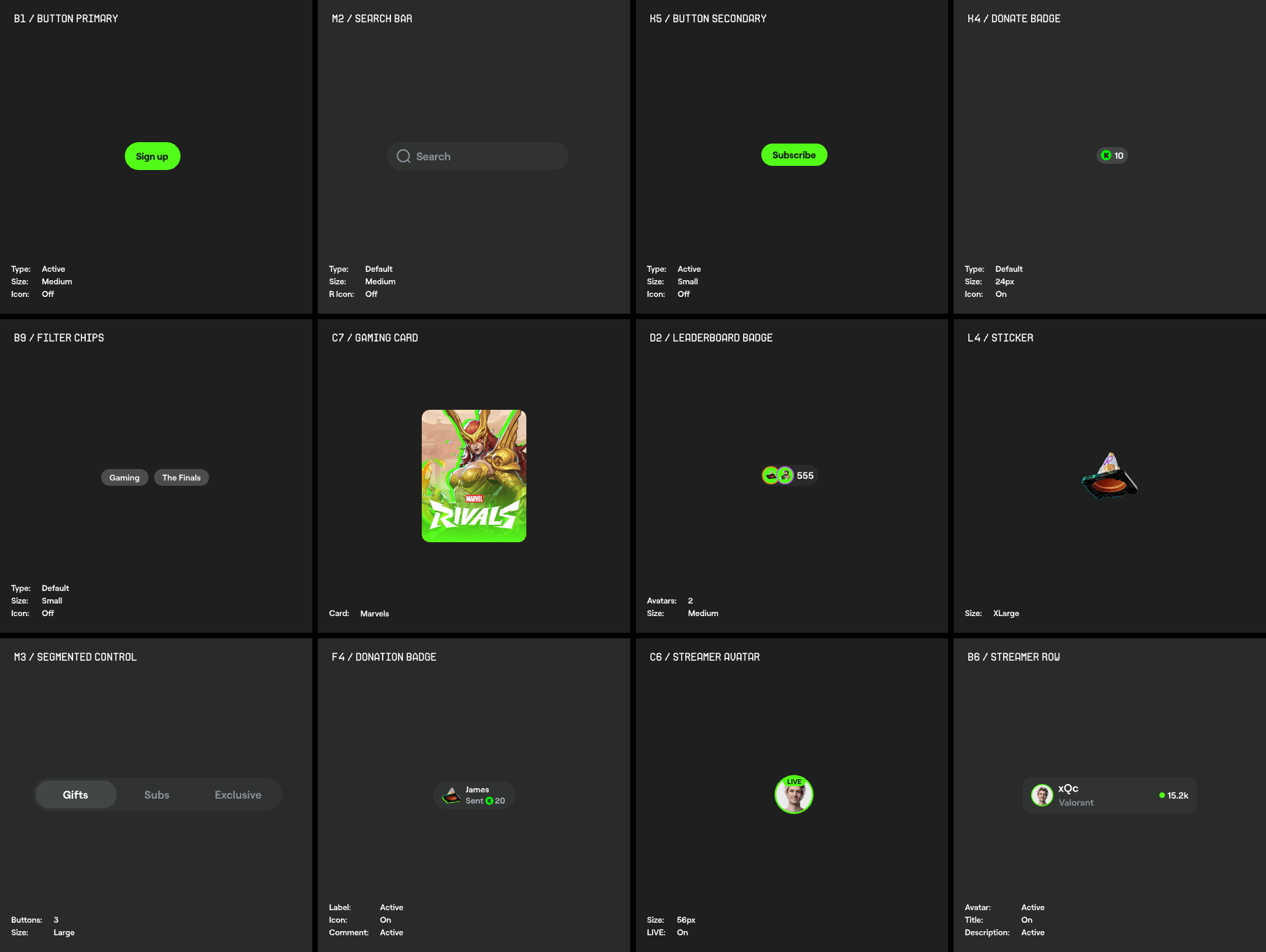
Design System
This section outlines various design system components and motion design for core buttons, input fields, containers and icons. I wanted to explore how each component animations and the overall experience of these core components.